Design a Professional Looking "About Us" Page

Giving a mature and professional look to your "About Us" webpage should be amongst your first priorities. Visitors have the right to know who you are and what you do and where you belong. Your About Us page is your Identity page where you add a little bio of your self and then explain the purpose of your blog or website. It's the most important page for both your regular visitors and advertisers. So Make sure you leave a good impression on them by presenting your self well. Just an hour ago I designed my personal "About Me" Page and I hope the tutorial today will make sense once you see this new proposed design,
What's New In it?
The Design includes 4 most important features which are:
- All Blogger Widgets below Post titles and at the bottom are kept hidden
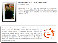
- Three beautiful Rows Describe your Entire Concept of Website i.e 1- Your Bio, 2- Blog Purpose and 3- Concluding paragraph.
- Passive Voice Speech is used to make things look professional
- It Loads in Seconds
If you think you really need one like that then I am sure you would love to read the tutorial below.
How To Create this About Us page?
For this tutorial I will suggest that you use Windows Live Writer. WLW will make your page design even more neat and clean. So lets get to work!
- Copy all data in your about us page in a notepad and keep it safe.
- Delete every thing in your about page and start writing a fresh bio about yourself in no more than 3-4 lines. Then add an your best picture to the left of your bio. See the example below,

3. Now you need to add some rows/paragraphs where you can talk about your services, goals etc. I would advise that you create at most two-three rows and keep them short in length. Use passive voice and avoid using "I am this and that" rather use a tone that may sound as if someone else is describing the author. Once you have written down the paragraphs then start enclosing each paragraph one by one between this code,
Do it for each paragraph. For example if you have written three paragraphs then enclose them in the codes like this,
Make these changes:
- To change the border color of the paragraph edit #686868 with your preferred color choice. Use our color generator tool.
- Replace ADD IMAGE LINK HERE with the URL of your image. Try to you use a small image 128px by 128px in size.
- To adjust the image size edit width="128" and height="128"
4. Finally save your page and publish it. Visit your About Us page to see it in action! :>
Hide Widgets
Now we need to hide all widgets that appear below post titles and at the bottom of posts. These widgets are normally the social bookmarking icons, AdSense code and related post widget which appears on all your posts. To hide them kindly follow these steps,
- Go To Blogger > Design > Edit HTML
- Backup your template
- Check the "Expand Widget Templates" box
- Search for ,
and just above it enclose all your widget codes between the code below,
Add all your widget codes between these two bolded lines. Replace ADD YOUR ABOUT US PAGE URL HERE with your About Us page link.
5. Do the same for all the widget codes below <data:post.body>
6. Finally save your template and visit your blog to see the page loading in seconds with a neat and clean look.
Blog Ilmu Matematika
http://ilmu-matematika.blogspot.com
Tidak ada komentar:
Posting Komentar